

12 Luxury color palettes to elevate your brand: sophisticated, timeless, and high-end
Creating a luxury brand that feels high-end, sophisticated, and timeless starts with your visual identity, and at the heart of that is your color palette. Colors are more than just decorative; they are powerful tools that convey your brand’s personality, evoke emotions, and even shape how your audience perceives your business. For luxury brands, selecting the right colors is a critical step in establishing your exclusivity and professionalism.
Luxury color palettes have the unique ability to communicate elegance, quiet confidence, and premium quality. Whether you’re designing a website, building out your social media presence, or launching high-ticket services, your color scheme sets the tone. Muted tones, neutral shades, and high contrast combinations are often hallmarks of upscale branding. They create a cohesive, refined identity that speaks to your audience without overwhelming them.
In this blog, I’ll share 12 luxury color palettes curated to help you elevate your brand. Whether you’re a small business owner, an interior designer, a wedding photographer, an e-commerce entrepreneur, or a beauty professional these color schemes will give your brand a polished, professional look that resonates with your ideal clients. Plus, I’ll share actionable tips on how to select the perfect luxury palette for your brand. Let’s dive into the world of sophisticated branding!
1. Neutrals and Crimson Red Color Palette
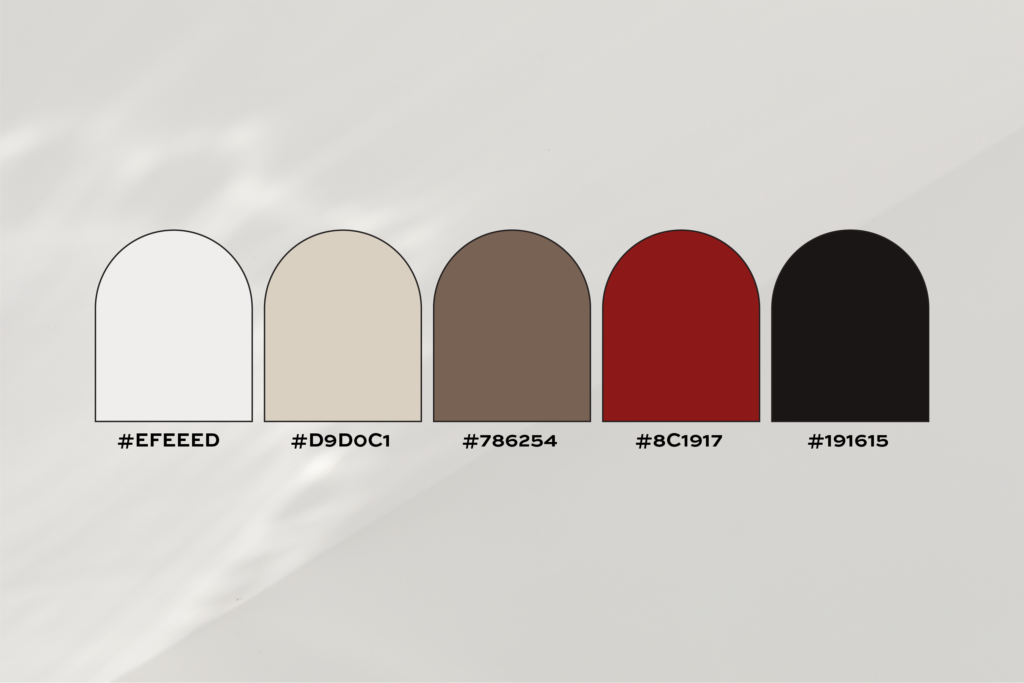
HEX Codes:
#EFEEED (Soft Ivory)
#D9D0C1 (Pale Taupe)
#786254 (Warm Brown)
#8C1917 (Crimson Red)
#191615 (Charcoal Black)
This palette balances soft ivory and pale taupe with the dramatic richness of crimson red and charcoal black. The warm brown adds depth, creating a timeless and polished look ideal for upscale brands looking to exude quiet elegance and bold sophistication. Perfect for businesses offering premium, high-ticket services.
Pro Tip:
Use the crimson red for small but impactful accents, think your logo or call to action buttons, to add a pop of personality without overpowering the design.
2. Cream and Forest Green Color Palette
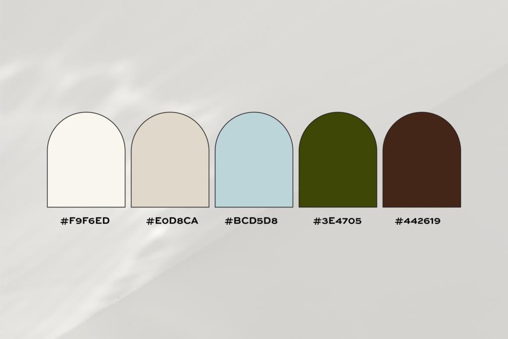
HEX Codes:
#F9F6ED (Cream)
#E0D8CA (Warm Beige)
#BCD5D8 (Sky Blue)
#3E4705 (Forest Green)
#442619 (Rich Brown)
A refined blend of cream, warm beige, and sky blue paired with forest green and rich brown. This palette conveys understated luxury and a connection to nature. It’s a great choice for brands in the wellness, eco-conscious, or lifestyle industries aiming to highlight their exclusivity with a sophisticated edge.
Pro Tip:
Use the forest green as a secondary color to highlight important elements, like icons or borders, and let the warm neutrals do the heavy lifting in your design.
3. Warm Ivory and Burnt Orange Color Palette
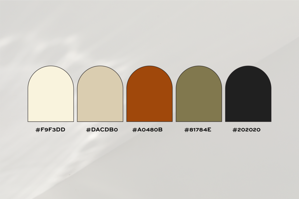
HEX Codes:
#F9F3DD (Warm Ivory)
#DACDB0 (Sandy Beige)
#A0480B (Burnt Orange)
#81784E (Muted Olive)
#202020 (Black)
This palette brings energy and warmth with its striking burnt orange, balanced by soft sandy beige and muted olive tones. The inclusion of black provides a sleek contrast, making this an excellent choice for brands that want to feel approachable yet high-end, like boutique shops or artisan services.
Pro Tip:
Use black sparingly to create contrast and keep the palette feeling rich without veering into overly bold territory.
4. Pale Greys and Stone Color Palette
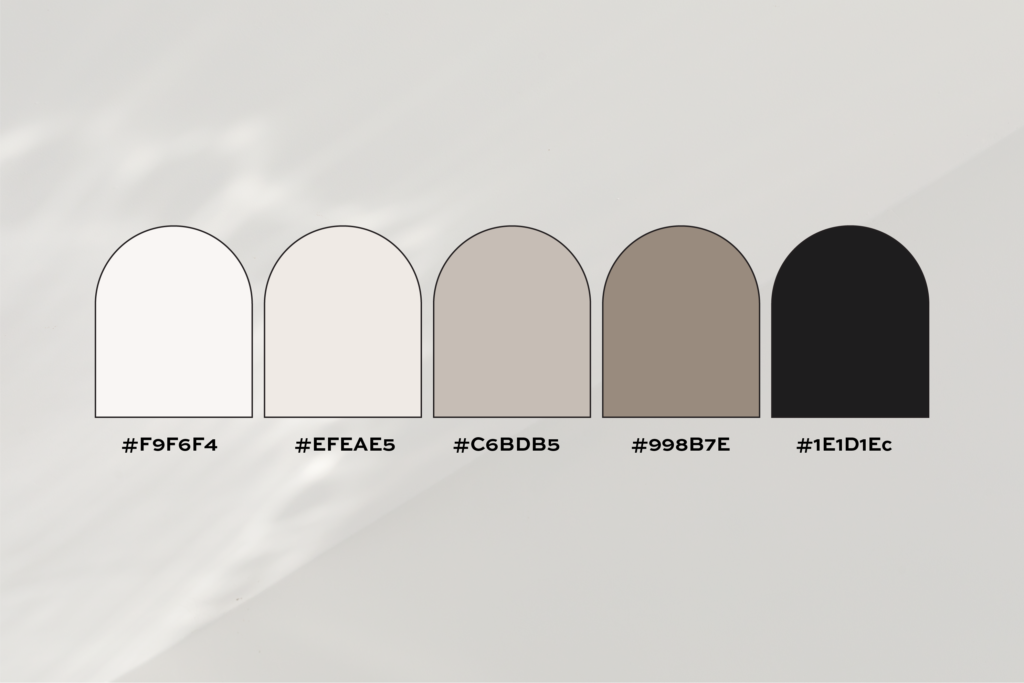
HEX Codes:
#F9F6F4 (Ivory)
#EFEAE5 (Pale Grey)
#C6BDB5 (Warm Grey)
#998B7E (Stone)
#1E1D1E (Deep Grey)
Pale greys and stone hues come together in this serene and modern palette. The subtle tones create a sense of effortlessness, while the deep grey adds a touch of authority. It’s perfect for brands that want to showcase a minimalist, high-end identity with sophistication and poise.
Pro Tip:
This palette is perfect for brands with a minimalist aesthetic. Pair it with clean typography and airy layouts for maximum impact.
5. Purple and Golden Color Palette
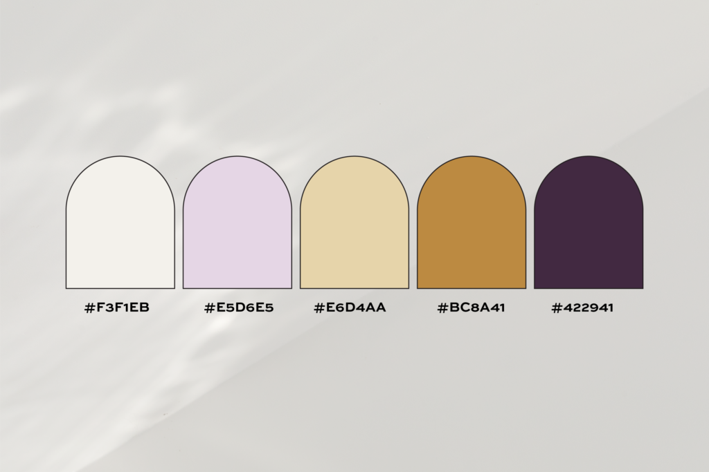
HEX Codes:
#F3F1EB (Off-White)
#E5D6E5 (Soft Lilac)
#E6D4AA (Light Gold)
#BC8A41 (Warm Copper)
#422941 (Deep Plum)
Soft lilac and warm copper steal the spotlight in this palette, offering a soft and luxurious aesthetic. Paired with light gold and deep plum, this combination creates an inviting yet opulent vibe. Ideal for beauty, fashion, or lifestyle brands targeting a discerning and feminine audience.
Pro Tip:
This palette is a dream for beauty or lifestyle brands. Use the copper sparingly for accents like foil details on packaging or typography.
6. Sage Green and Mahogany Color Palette
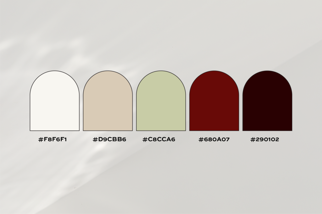
HEX Codes:
#F8F6F1 (Ivory)
#D9CBB6 (Pale Beige)
#C8CCA6 (Sage Green)
#680A07 (Crimson Red)
#290102 (Dark Mahogany)
Crimson red commands attention in this rich and bold palette. Balanced with sage green, pale beige, and dark mahogany, it offers a classic yet modern feel that exudes strength and elegance. It’s perfect for brands looking to stand out with a powerful, high-impact identity.
Pro Tip:
Crimson red works beautifully for bold statements like your logo, while the sage green keeps the overall look refined.
7. Warm Beige and Chocolate Brown Color Palette
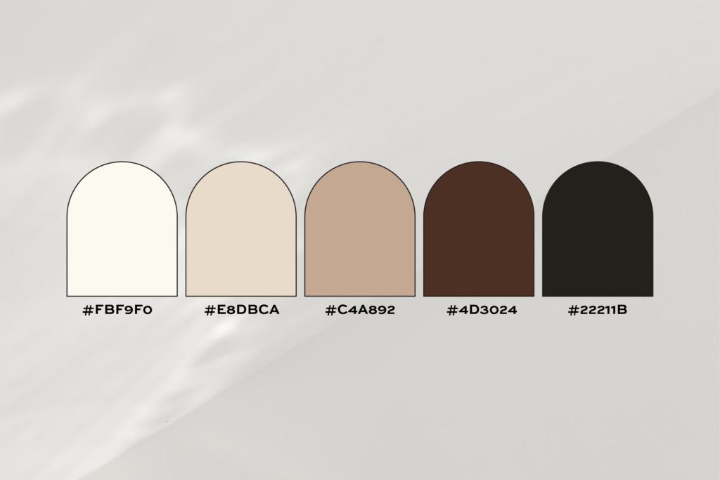
HEX Codes:
#FBF9F0 (Ivory)
#E8DBCA (Warm Beige)
#C4A892 (Soft Brown)
#4D3024 (Chocolate Brown)
#22211B (Deep Charcoal)
This palette blends warm beige and soft brown with chocolate brown and deep charcoal for a look that feels effortlessly luxurious. It’s ideal for premium lifestyle brands or service providers looking to create a cozy yet refined aesthetic that appeals to clients who value quality.
Pro Tip:
Use the soft brown as a foundation color and chocolate brown sparingly for accents to create a sense of balance.
8. Blush and Deep Teal Color Palette
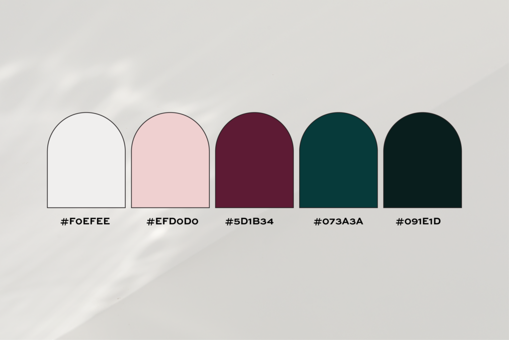
HEX Codes:
#F0EFEE (Off-White)
#EFD0D0 (Blush Pink)
#5D1B34 (Deep Burgundy)
#073A3A (Deep Teal)
#091E1D (Charcoal Black)
Blush pink and deep teal create a striking contrast in this bold and sophisticated palette. Deep burgundy and charcoal black add richness, making it a great fit for upscale brands wanting to communicate a sense of exclusivity and confidence. Perfect for industries like interior design or boutique hospitality.
Pro Tip:
Use deep teal for unexpected pops of color, like buttons or icons, to add intrigue to your branding.
9. Slate Blue and Taupe Color Palette
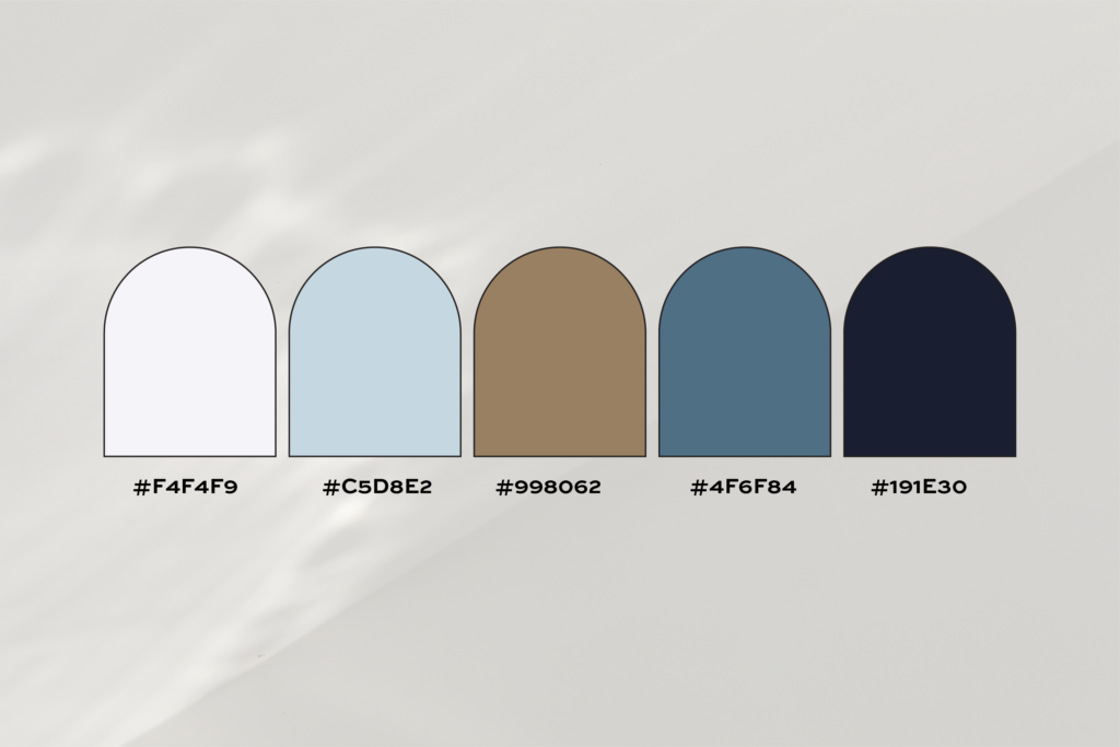
HEX Codes:
#F4F4F9 (Ivory White)
#C5D8E2 (Pale Blue)
#998062 (Slate Blue)
#4F6F84 (Warm Taupe)
#191E30 (Charcoal Grey)
Slate blue shines in this palette, offering a calm and professional vibe complemented by warm taupe and pale blue. Charcoal grey adds structure, making it a smart choice for service-based businesses or consultants aiming to exude trust and expertise.
Pro Tip:
This palette works well for service-based brands that want to convey trust and expertise without being flashy.
10. Sage Green and Dark Charcoal Color Palette
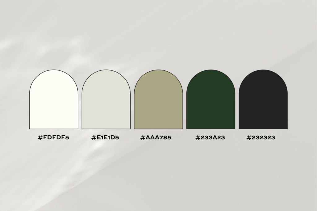
HEX Codes:
#FDFDF5 (Ivory)
#E1E1D5 (Light Grey)
#AAA785 (Sage Green)
#233A23 (Forest Green)
#232323 (Dark Charcoal)
Soft sage green pairs beautifully with forest green and dark charcoal to create a natural yet polished look. Light grey and ivory add a modern touch, making this palette ideal for eco-conscious or health-focused brands seeking to communicate balance and sophistication.
Pro Tip:
Use ivory and light grey as the base and sage green for subtle accents to keep the palette fresh.
11. Blush Pink and Wine Red Color Palette
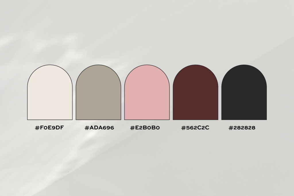
HEX Codes:
#F0E9DF (Ivory White)
#ADA696 (Warm Grey)
#E2B0B0 (Blush Pink)
#562C2C (Wine Red)
#282828 (Charcoal)
Blush pink’s softness contrasts with wine reds’s boldness in this timeless palette. Warm grey and charcoal brown add layers of complexity, creating a palette that feels both approachable and commanding. It’s perfect for luxury brands targeting a stylish yet practical audience.
Pro Tip:
Use navy blue sparingly for bold elements like headings or logos to make an elegant statement.
12. Warm Beige and Teal Color Palette
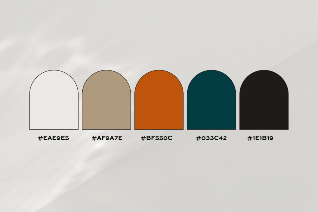
HEX Codes:
#EAE9E5 (Warm Beige)
#AF9A7E (Soft Brown)
#BF550C (Burnt Orange)
#033C42 (Deep Teal)
#1E1B19 (Black)
This palette blends warm beige and burnt orange with deep teal for a vibrant yet sophisticated aesthetic. The dark brown and soft brown tones provide balance, making it a versatile choice for brands that want to communicate creativity and upscale professionalism.
Pro Tip:
Burnt orange adds vibrancy, so use it as an accent for things like call to action buttons or social media graphics.
How to Choose the Right Luxury Color Palette
Selecting the perfect luxury color palette for your brand is about more than just picking pretty colors, it’s about understanding the emotions, values, and messages your brand needs to convey. A well chosen color palette not only creates a cohesive visual identity but also communicates sophistication, quality, and exclusivity to your audience. Here’s how to ensure your luxury brand’s color palette reflects these high-end qualities:
1. Start with Your Brand’s Personality
Think about your brand as if it were a person. Is it bold and attention-grabbing like crimson red and charcoal black, or is it understated and calming like soft ivory and sage green? A luxury brand’s personality is often rooted in exclusivity, timelessness, and quiet confidence. Choose colors that align with these traits and your unique identity.
Example: A brand offering bespoke interior design services might lean toward earthy tones like beige and deep green to communicate warmth and professionalism, while a high-ticket coaching business might prefer the confidence of navy blue and gold.
2. Understand Your Audience
Luxury branding is all about making your audience feel something. Who are your ideal clients, and what do they value most? Are they drawn to the bold contrasts of dramatic palettes, or do they prefer soft, muted tones that exude quiet elegance? Your audience’s preferences should guide your choices.
Tip: Conduct market research or gather feedback from your target audience to see which colors resonate with them. For instance, younger audiences may favor modern palettes with subtle gold accents, while older clients might appreciate timeless neutrals.
3. Keep It Muted and Refined
Luxury palettes often rely on muted tones and neutral shades. Bright, neon colors can feel jarring or overly trendy, which detracts from a brand’s timeless appeal. Stick to soft, subdued hues like blush pink, sage green, or taupe, and balance them with darker tones for contrast.
Why it works: Muted tones create a sense of sophistication by being easy on the eyes and universally appealing. These shades evoke calmness, confidence, and exclusivity.
4. Test Your Palette Across Platforms
Your colors will appear in a variety of contexts, from websites and social media to packaging and print materials. Make sure your chosen palette looks great everywhere. Test how your colors perform in different lighting, backgrounds, and applications.
Example: A soft blush pink might look elegant on your website but could feel washed out in print. Similarly, dark charcoal could lose its richness if it’s not paired with a complementary shade.
5. Use Psychology to Your Advantage
Colors evoke emotions and influence perceptions. Understanding color psychology can help you align your palette with the feelings you want to inspire in your audience.
Examples:
- Navy Blue: Trust, professionalism, and authority.
- Blush Pink: Softness, elegance, and approachability.
- Gold: Wealth, prestige, and success.
- Green: Growth, balance, and harmony.
6. Work with a Professional Designer
Choosing a luxury color palette can feel overwhelming, especially if you’re not sure how to translate your vision into cohesive branding. A professional designer can guide you through the process, helping you select a palette that aligns with your brand’s personality, audience, and goals.
Why it matters: Your color palette is the foundation of your visual identity. A cohesive and strategically chosen palette ensures your brand looks polished, consistent, and luxurious across every platform.
Create a High-End Brand with a Luxury Color Palette
Choosing the right luxury color palette for your brand can feel like an overwhelming task, but it’s one of the most rewarding aspects of building a cohesive visual identity. The colors you select will influence how your audience feels about your brand before they’ve even read a single word. Whether you’re drawn to warm neutrals, bold jewel tones, or elegant contrasts, your color palette should align with your brand’s values, personality, and audience.
As we’ve explored, each of these 12 luxury color palettes offers a unique way to communicate upscale elegance, professionalism, and exclusivity. But remember, your color palette is just one piece of the puzzle. A truly luxurious brand is cohesive across every element, from your visuals and messaging to your website and packaging.
Want these palettes with hex codes ready to use? Download my free Color Palette Guide with 15 curated palettes, font pairings, and everything you need to pick your brand colors and move on.
If you’re ready to create a sophisticated brand that stands the test of time, I can help. As a professional brand and website designer, I specialize in crafting cohesive, high-end identities that resonate with your audience and set you apart from the competition. Book a consultation today to get started.
And if you’re not sure where to begin, check out my blog, A Pre-Project Checklist Before Hiring a Brand or Website Designer, for tips on preparing for a successful branding or website design process. Together, we’ll build a brand that reflects your vision and elevates your business to new heights.
Leave a Reply
Ready for a brand + website that actually feels like you?
If you're tired of cringing every time someone asks for your website, or if you've been putting off your rebrand because it feels overwhelming, let's talk. Book a free consultation call and we'll figure out what you need.

